GUI Customization Guide
Ren'Py features a GUI system that (we hope) looks attractive out of the box, can be customized somewhat, and can be replaced entirely if necessary. This page explains how to do simple and intermediate levels of GUI customization.
For more advanced customization, please take a look at the documentation for styles (including the list of style properties) and screens (including screen actions and special screens).
This assumes that you're using a new-style Ren'Py GUI (contained in the gui.rpy
file). Older GUIs (that use the screens.rpy file) should be treated as advanced
GUI customization for the purposes of this guide.
Simple GUI Customization
There are a few simple pieces of GUI customization that make sense for
all but the simplest visual novels. What these customizations have in
common is that they do not require editing gui.rpy. These customizations
change the GUI somewhat, but do not drastically change the look of the
GUI.
Change Size and Colors
The easiest thing to change about the GUI is to change the size and color of the GUI. Ren'Py will prompt you to make these choices when you first create a project, but choosing "Change/Update GUI" in the launcher will let you change your choice.
When changing the GUI through the launcher, Ren'Py will prompt if you
want to simply change the launcher, or update gui.rpy. Both choices
will overwrite most image files, and overwriting gui.rpy will get rid
of changes to that file.
As a result, you probably want to do this before any other customization.
Ren'Py will prompt for the default resolution of the project, and then also for the color scheme to use. Once you select those, it will update the GUI to match your choices.
Options.rpy
There are a couple of variables in options.rpy that are used by the
GUI.
config.nameA string giving a human-readable name for the game. This is used as the window title, and throughout the GUI wherever the title of the game is needed.
gui.show_nameThis should be set to False to hide the title and version number from the main menu. (Say, because the title is "baked into" the main menu image.)
config.versionA string giving the version of the game. This is presented to the user in various places in the default GUI. It has other uses apart from that, such as error messages or tracebacks.
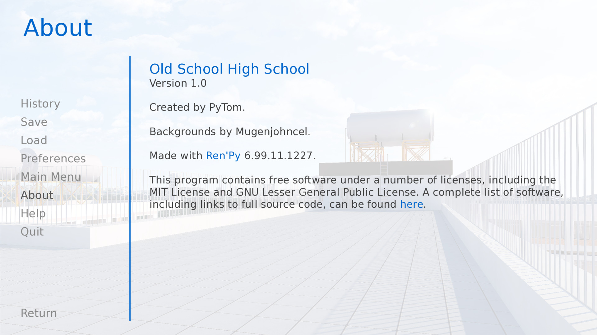
gui.aboutAdditional text that is added to the about screen. If you want multiple paragraphs of credits, \n\n can be used to separate the paragraphs.
Here's an example of these defines:
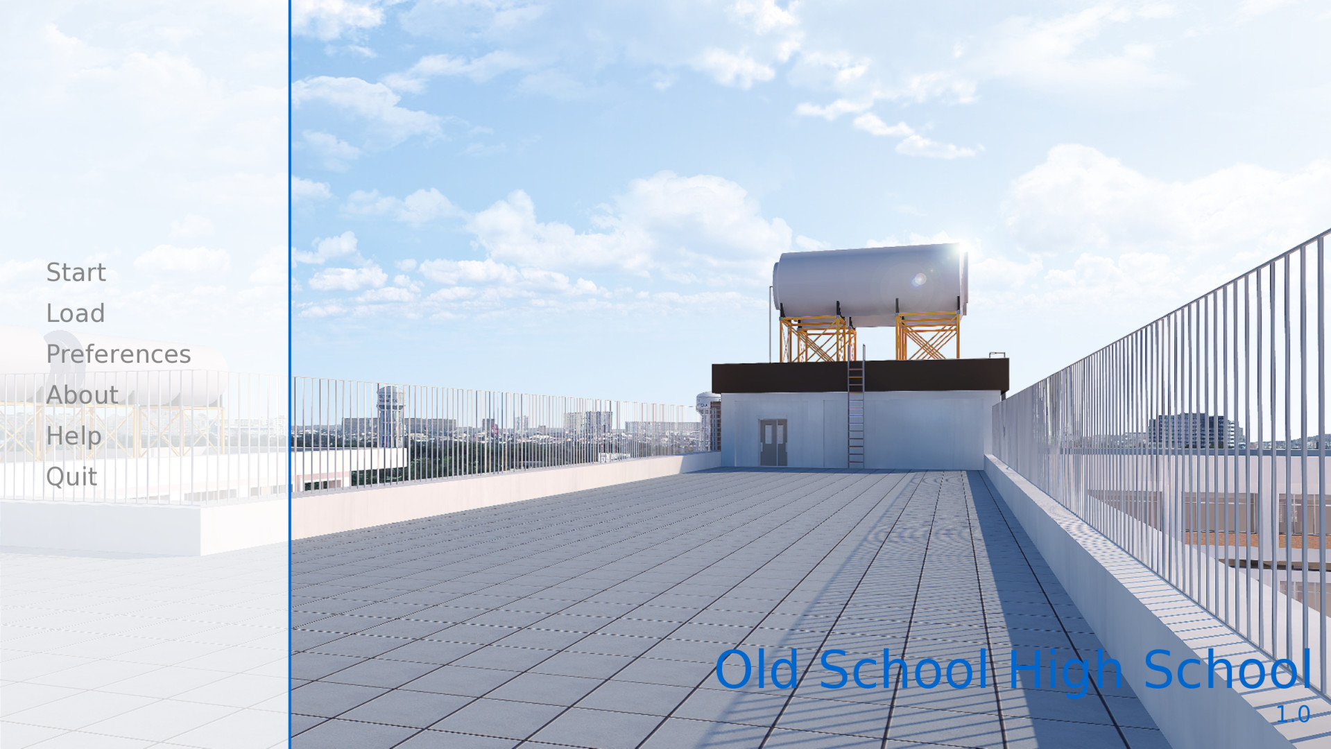
define config.name = _('Old School High School')

define gui.show_name = True

define config.version = "1.0"

define gui.about = _("Created by PyTom.\n\nHigh school backgrounds by Mugenjohncel.")
For convenience, it might make sense to define gui.about using a triple-quoted string, in which case line endings are respected.
define gui.about = _("""\
Created by PyTom.

High school backgrounds by Mugenjohncel.""")
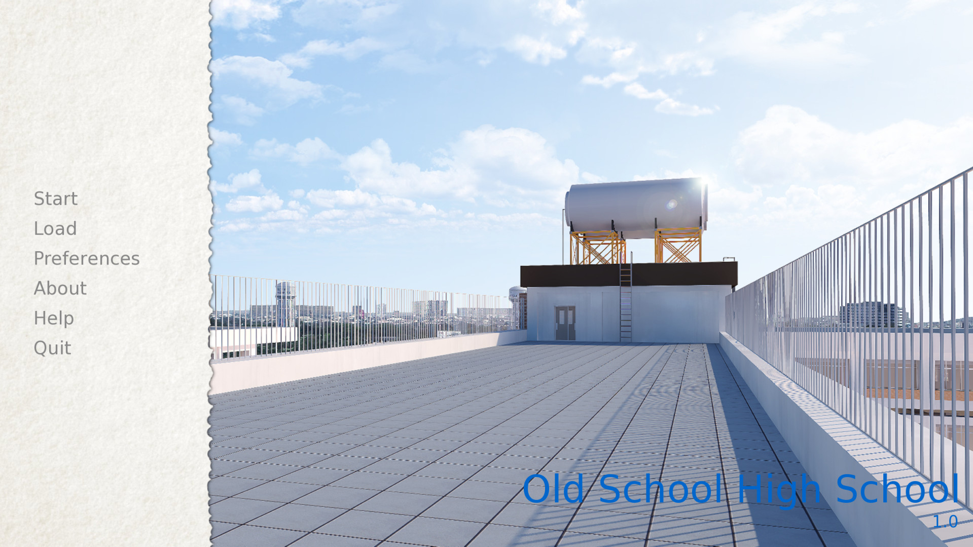
Game and Main Menu Background Images
The images used by the GUI can be found in the game/gui directory, which can be opened by choosing "Open Directory: gui" from the launcher. The relevant files are:
- gui/main_menu.png
A file that contains an image that is used in the background of all screens of the main menu.
- gui/game_menu.png
A file that contains an image that is used in the background of all screens of the game menu.
The main menu, with only gui/main_menu.png replaced.
The about screen can be part of the game menu (using gui/game_menu.png
as the background) or the main menu (using gui/main_menu.png as the
background). Both can be set to the same image.
Window Icon
The window icon is the icon that is displayed (in places like the Windows task bar and Macintosh dock) by a running application.
The window icon can be changed by replacing gui/window_icon.png.
Note that this only changes the icon used by the running game. To change the icon used by Windows .exe files and Macintosh applications, see the build documentation.
Intermediate GUI Customization
Next, we will demonstrate the intermediate level of GUI customization. At the intermediate level, it's possible to change the colors, fonts, and images used by the game. In general, intermediate customization keeps the screens mostly the same, with buttons and bars in the same places, although modifying the screens to add new functionality is certainly possible.
Many of these changes involve editing variables in gui.rpy. For example,
to increase the dialogue font size, find the line that reads:
define gui.text_size = 22
and increase or decrease it, for example, to:
define gui.text_size = 20
Note that the default values are often different than what's found in
this documentation. The default values can changed based on size and
colors selected for the game, and the values in this file are an example
of extensive GUI customization. It's best to search gui.rpy for define and
the variable in question – for example, define gui.text_size.
Some of the adjustments below either partially or completely effect image files. As a result, the changes only take effect when the image files themselves are updated, which can be done by choosing "Change GUI" in the launcher, and telling it to regenerate image files. (But note that doing so will overwrite any image files you have already modified.)
You may want to consider waiting until your game is nearly complete before
customizing gui.rpy in this way. While old gui.rpy files will work in newer
Ren'Py versions, newer gui.rpy files may have features and fixes that older
versions lack. Customizing the GUI early may make it harder to take
advantage of such improvements.
Dialogue
There are a number of relatively easy customizations that can be performed to change how dialogue is displayed to the player. The first is changing the textbox.
- gui/textbox.png
This file contains the background of the text window, displayed as part of the say screen. While this should be the full width of the game, text is only displayed in the central 60% of the screen, with a 20% border on either side.
In addition, there are a number of variables that can be customized to change dialogue.
- define gui.text_color = "#402000"
This sets the color of the dialogue text.
- define gui.text_font = "ArchitectsDaughter.ttf"
This sets the font that is used for dialogue text, menus, inputs, and other in-game text. The font file should exist in the game directory.
- define gui.text_size = 33
Sets the size of the dialogue text. This may need to be increased or decreased to fit the selected font in the space allotted.
- define gui.name_text_size = 45
Sets the size of character names.
By default, the character name label uses the accent color. The color can be easily changed when defining a character:
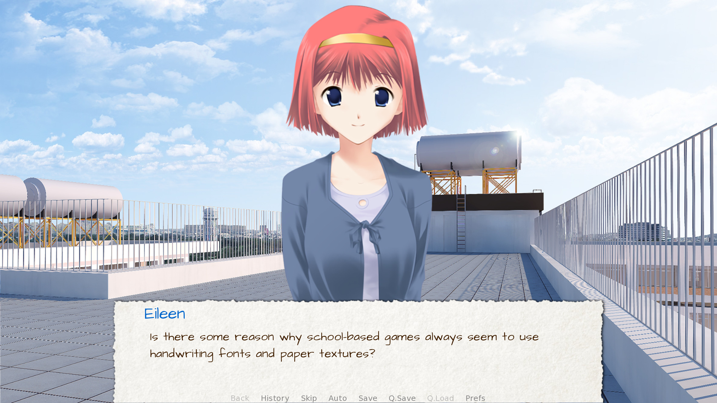
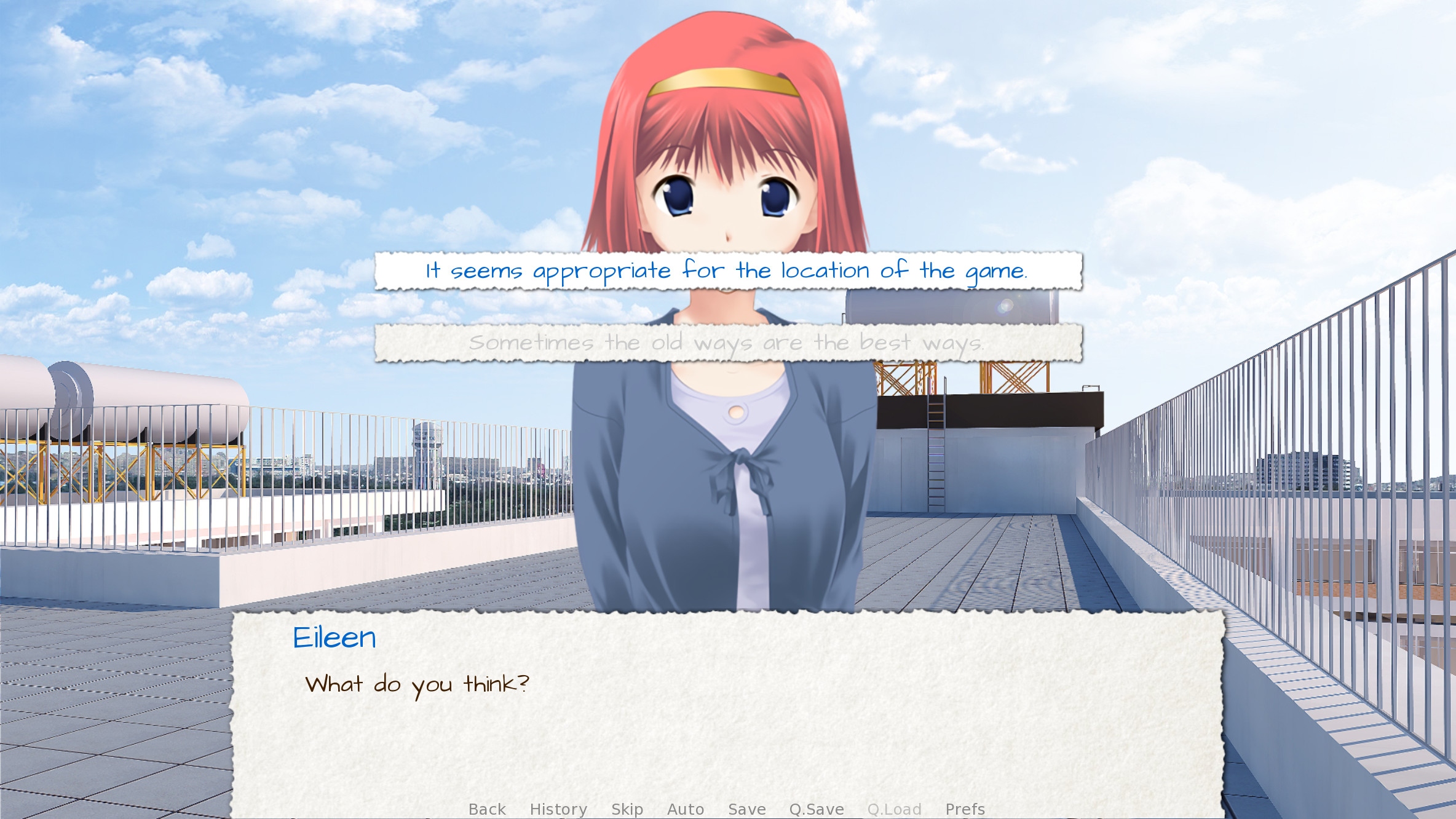
define e = Character("Eileen", who_color="#104010")
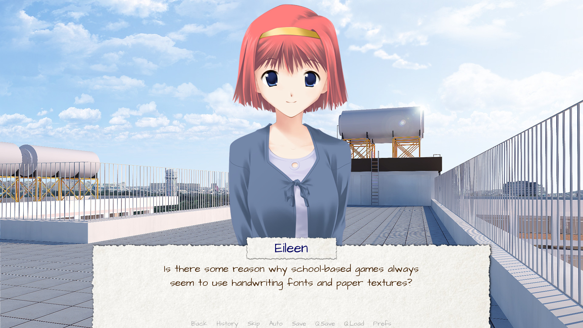
An example textbox image.
Dialogue customized using the textbox image and the variable settings given above.
Choice Menus
The choice screen is used by the menu statement to display choices to the player. Again, there are some relatively easy customizations that can be performed on the choice screen. The first are the two image files:
- gui/button/choice_idle_background.png
This image is used as the background of choice buttons that are not focused.
- gui/button/choice_hover_background.png
This image is used as the background of choice buttons that are focused.
By default, text is placed in the central 75% of these images. There are also a couple of variables that control the color of the text in choice buttons.
- define gui.choice_button_text_idle_color = '#888888'
The color used for the text of unfocused choice buttons.
- define gui.choice_button_text_hover_color = '#0066cc'
The color used for the text of focused choice buttons.
These should suffice for simple customization, where the size of the images does not need to be changed. For more complex customizations, check out the section on buttons, below.

An example gui/button/idle_background.png image.

An example gui/button/choice_hover_background.png image.
An example of the choice screen, as customized using the images and variable settings given above.
Overlay Images
There are also a pair of overlay images. These are used to darken or lighten the background image to make buttons and other user interface components more readable. These images are in the overlay directory:
- gui/overlay/main_menu.png
The overlay used by the main menu screen.
- gui/overlay/game_menu.png
The overlay used by game-menu-like screens, including load, save, preferences, about, help, etc. This overlay is selected by the screen in question, and is used even when at the main menu.
- gui/overlay/confirm.png
The overlay used in the confirm screen to darken the background.
Here are a pair of example overlay images, and what the game looks like with the overlay images added.
An example gui/overlay/main_menu.png image.
An example gui/overlay/game_menu.png image.
The main menu after changing the overlays.
The game menu after changing the overlays.
Colors, Fonts, and Font Sizes
There are a number of GUI variables that can be used to change the color, font, and size of text.
These variables should generally be set to hexadecimal color codes, which are are strings of the form "#rrggbb" (or "#rrggbbaa" to specify an alpha component), similar to color codes used by web browsers. For example, "#663399" is the code for a shade of purple. There are many tools online that let you create HTML color codes, such as this one.
In addition to gui.text_color, gui.choice_idle_color, and gui.choice_hover_color,
documented above, the following variables exist:
- define gui.accent_color = '#000060'
The accent color is used in many places in the GUI, including titles and labels.
- define gui.idle_color = '#606060'
The color used for most buttons when not focused or selected.
- define gui.idle_small_color = '#404040'
The color used for small text (like the date and name of a save slot, and quick menu buttons) when not hovered. This color often needs to be a bit lighter or darker than idle_color to compensate for the smaller size of the font.
- define gui.hover_color = '#3284d6'
The color used by focused items in the GUI, including the text of of buttons and the thumbs (movable areas) of sliders and scrollbars.
- define gui.selected_color = '#555555'
The color used by the text of selected buttons. (This takes priority over the hover and idle colors.)
- define gui.insensitive_color = '#8888887f'
The color used by the text of buttons that are insensitive to user input. (For example, the rollback button when no rollback is possible.)
- define gui.interface_text_color = '#404040'
The color used by static text in the game interface, such as text on the help and about screens.
- define gui.muted_color = '#6080d0'
- define gui.hover_muted_color = '#8080f0'
Muted colors, used for the sections of bars, scrollbars, and sliders that do not represent the value or visible area. (These are only used when generating images, and will not take effect until images are regenerated in the launcher.)
In additional to gui.text_font, the following variables selects the
fonts used for text. These fonts should also be placed in the game directory.
- define gui.interface_text_font = "ArchitectsDaughter.ttf"
The font used for text for user interface elements, like the main and game menus, buttons, and so on.
- define gui.system_font = "DejaVuSans.ttf"
The font used for system text, like exception messages and the shift+A accessibility menu. This should be able to handle both ASCII and the game's translated language.
- define gui.glyph_font = "DejaVuSans.ttf"
A font used for certain glyphs, such as the arrow glyphs used by the skip indicator. DejaVuSans is a reasonable default for these glyphs, and is automatically included with every Ren'Py game.
In addition to gui.text_size and gui.name_text_size, the following
variables control text sizes.
- define gui.interface_text_size = 36
The size of static text in the game's user interface, and the default size of button text in the game's interface.
- define gui.label_text_size = 45
The size of section labels in the game's user interface.
- define gui.notify_text_size = 24
The size of notification text.
- define gui.title_text_size = 75
The size of the game's title.
The game menu after customizing text colors, fonts, and sizes.
Borders
There are a number of GUI components – such as buttons and bars – that use scalable backgrounds configured using Border objects. Before discussing, how to customize buttons and bars, we'll first describe how this works.
Borders are given to the Frame() displayable.
A Frame takes an image, and divides it into nine parts – the four corners,
the four sides, and the center. The corners always remain the same size,
the left and right sides are stretched vertically, the top and bottom sides
are stretched horizontally, and the center is stretched in both directions.
A Borders object gives the size of each of the borders, in left, top, right, bottom order. So if the following border image is used:
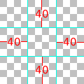
along with the following borders:
Borders(40, 40, 40, 40)
one possible result is this:
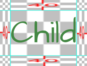
As the child changes size, so will the background.
A Border object can also be given padding, including negative padding that causes the child to overlap the borders. For example, these borders:
Borders(40, 40, 40, 40, -20, -20, -20, -20)
allow the child to overlap the sides. Note that due to this overlap, the result is smaller, since the borders themselves now take up less space.
Borders can also be tiled, rather than scaled. This is invoked by variables, and produces this result.
These example images are a bit ugly, since we need to show what's going on. In practice, this system can produce quite pleasing results. This is the case when a Frame displayable is used as the background of a frame window holding user interface components.
These frame windows can be customized in two ways. The first is by changing the background image file:
- gui/frame.png
The image used as the background of frames windows.
And the second is by customizing variables.
- define gui.frame_borders = Borders(15, 15, 15, 15)
The borders applied to frame windows.
- define gui.confirm_frame_borders = Borders(60, 60, 60, 60)
The borders applied to the fame used in the confirm screen.
- define gui.frame_tile = True
If true, the sides and center of the confirm screen are tiled. If false, they are scaled.
An example gui/frame.png image.
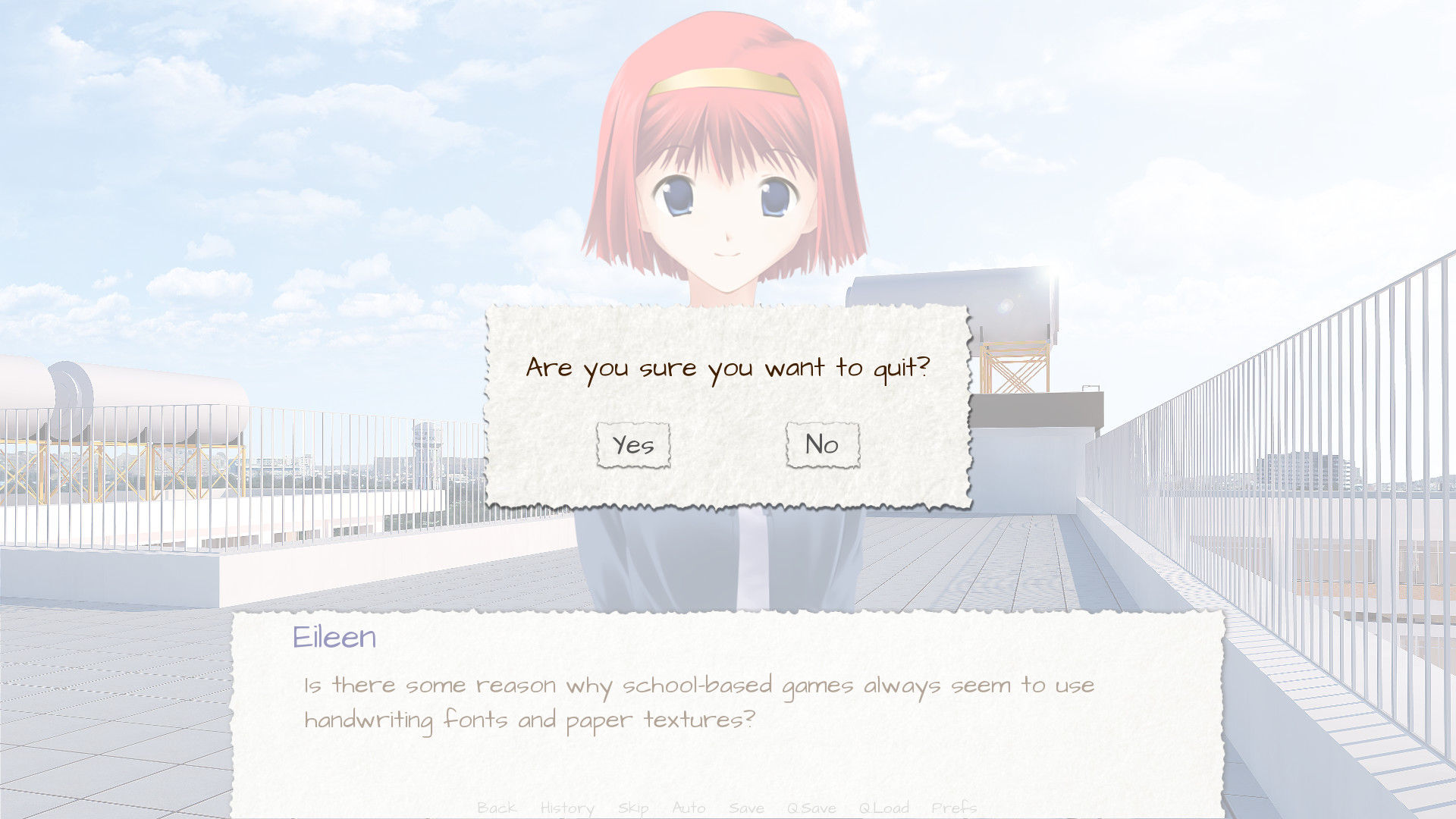
The confirm screen after applying the customizations given above.
Buttons
The Ren'Py user interface includes a large number of buttons, buttons that come in different sizes and that are used for different purposes. The various kinds of buttons are:
- button
A basic button. Used for navigation within the user interface.
- choice_button
A button used for choices in the in-game menu.
- quick_button
A button, displayed in-game, that is intended to allow quick access to the game menu.
- navigation_button
A button used in main and game menu for navigation between screens, and to start the game.
- page_button
A button used to switch between pages on the load and save screens.
- slot_button
Buttons that represent file slots, and contain a thumbnail, the save time, and an optional save name. These are described in more detail below.
- radio_button
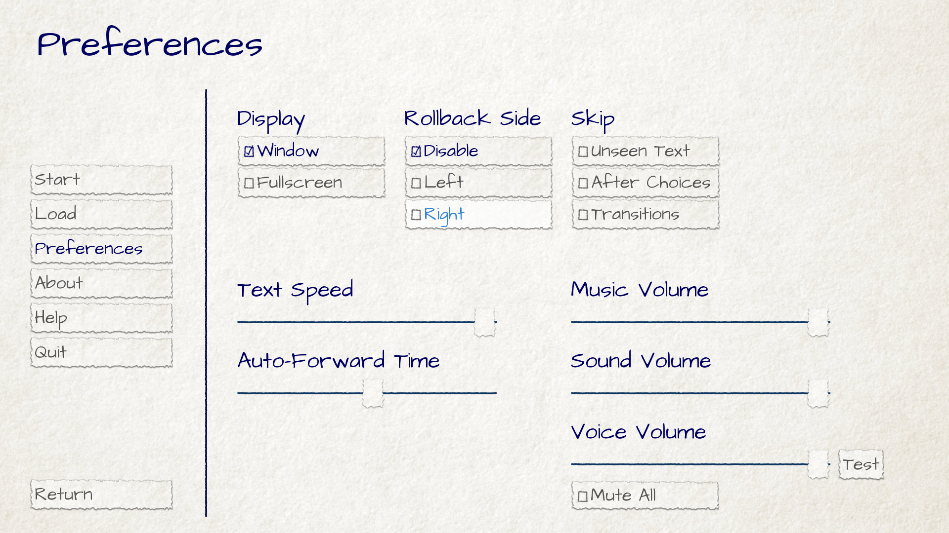
A button used for multiple-choice preferences on the preferences screen.
- check_button
A button used for toggleable preferences on the preferences screen.
- test_button
A button used to test audio playback on the preferences screen. This should be the same height as a horizontal slider.
- help_button
A button used to select what kind of help the player wants.
- confirm_button
A button used on the confirm screen to select yes or no.
- nvl_button
A button used for an NVL-mode menu choice.
The following image files are used to customize button backgrounds, if they exist.
- gui/button/idle_background.png
The background image used by buttons that are not focused.
- gui/button/hover_background.png
The background image used by buttons that are focused.
- gui/button/selected_idle_background.png
The background image used by buttons that are selected but not focused. This is optional, and is used in preference to
idle_background.pngif it exists.- gui/button/selected_hover_background.png
The background image used by buttons that are selected but not focused. This is optional, and is used in preference to
hover_background.pngif it exists.
More specific backgrounds can be given for each kind of button, by
prefixing it with the kind. For example, gui/button/check_idle_background.png
is used as the background of check buttons that are not focused.
Four image files are used as foreground decorations on radio and check buttons, to indicate if the option is chosen or not.
- gui/button/check_foreground.png, gui/button/radio_foreground.png
These images are used when a check or radio button is not selected.
- gui/button/check_selected_foreground.png, gui/button/radio_selected_foreground.png
These images are used when a check or radio button is selected.
The following variables set various properties of buttons:
- define gui.button_width = None
- define gui.button_height = 64
The width and height of a button, in pixels. If None, the size is automatically determined based on the size of the text inside a button, and the borders given below.
- define gui.button_borders = Borders(10, 10, 10, 10)
The borders surrounding a button, in left, top, right, bottom order.
- define gui.button_tile = True
If true, the sides and center of the button background are tiled to increase or decrease their size. If false, the sides and center are scaled.
- define gui.button_text_font = gui.interface_font
- define gui.button_text_size = gui.interface_text_size
The font and size of the button text.
- define gui.button_text_idle_color = gui.idle_color
- define gui.button_text_hover_color = gui.hover_color
- define gui.button_text_selected_color = gui.accent_color
- define gui.button_text_insensitive_color = gui.insensitive_color
The color of the button text in various states.
- define gui.button_text_xalign = 0.0
The horizontal alignment of the button text. 0.0 is left-aligned, 0.5 is centered, and 1.0 is right-aligned.
- define gui.button_image_extension = ".png"
The extension for button images. This could be changed to .webp to use WEBP button images instead of png ones.
These variables can be prefixed with the button kind to configure a
property for a particular kind of button. For example,
gui.choice_button_text_idle_color configures the color of
an idle choice button.
For example, we customize these variables in our sample game.
Increases the width of navigation buttons.
- define gui.radio_button_borders = Borders(40, 10, 10, 10)
- define gui.check_button_borders = Borders(40, 10, 10, 10)
Increases the width of radio and check button borders, leaving extra space on the left for the check mark.
Here's an example of how the play screen can be customized.

An example gui/button/idle_background.png image.

An example gui/button/hover_background.png image.

An image that can be used as gui/button/check_foreground.png and
gui/button/radio_foreground.png.

An image that can be used as gui/button/check_selected_foreground.png and
gui/button/radio_selected_foreground.png.
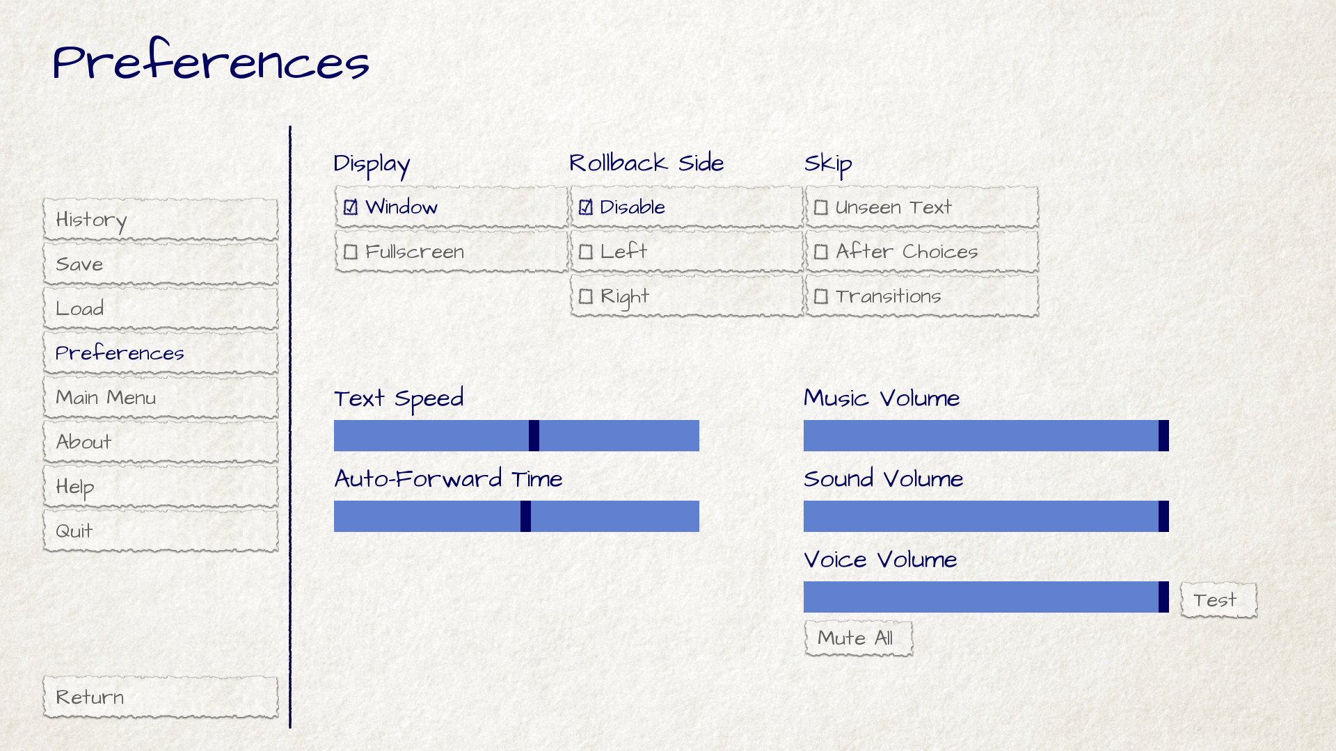
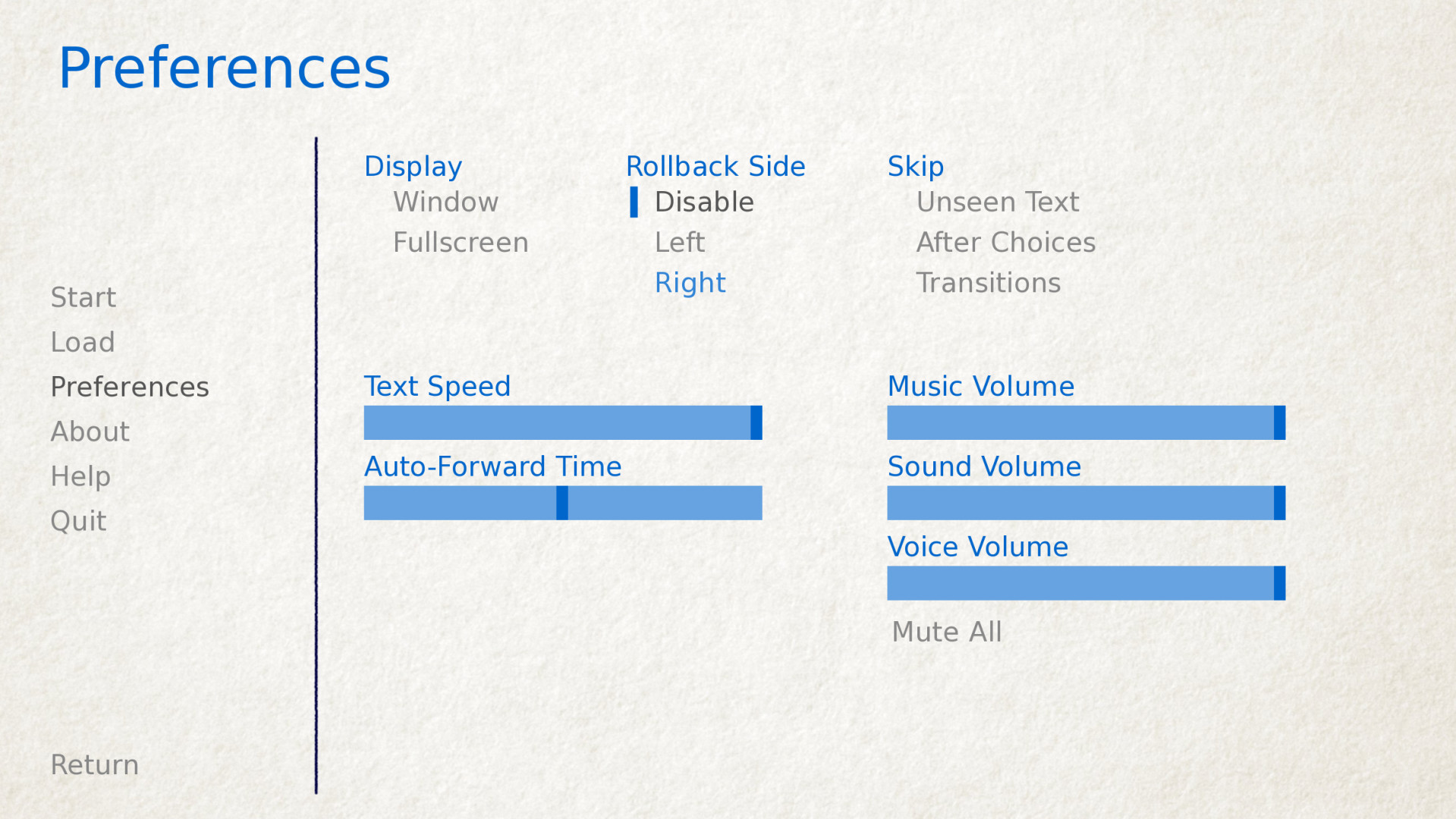
The preferences screen with the customizations described in this section applied.
Save Slot Buttons
The load and save screens use slot buttons, which are buttons that present a thumbnail and information about when the file was saved. The following variables are quite useful when it comes to customizing the size of the save slots.
- define gui.slot_button_width = 414
- define gui.slot_button_height = 309
The width and height of the save slot button.
- define gui.slot_button_borders = Borders(15, 15, 15, 15)
The borders applied to each save slot.
config.thumbnail_width = 384 and config.thumbnail_height = 216
set the width and height of the save thumbnails. Note that these live in
the config namespace, not the gui namespace. These do not take effect
until the file is saved and loaded.
- define gui.file_slot_cols = 3
- define gui.file_slot_rows = 2
The number of columns and rows in the grid of save slots.
There are the background images used for save slots.
- gui/button/slot_idle_background.png
The image used for the background of save slots that are not focused.
- gui/button/slot_hover_background.png
The image used for the background of save slots that are focused.
Putting those to use, we get:
An example gui/button/slot_idle_background.png image.
An example gui/button/slot/slot_hover_background.png image.
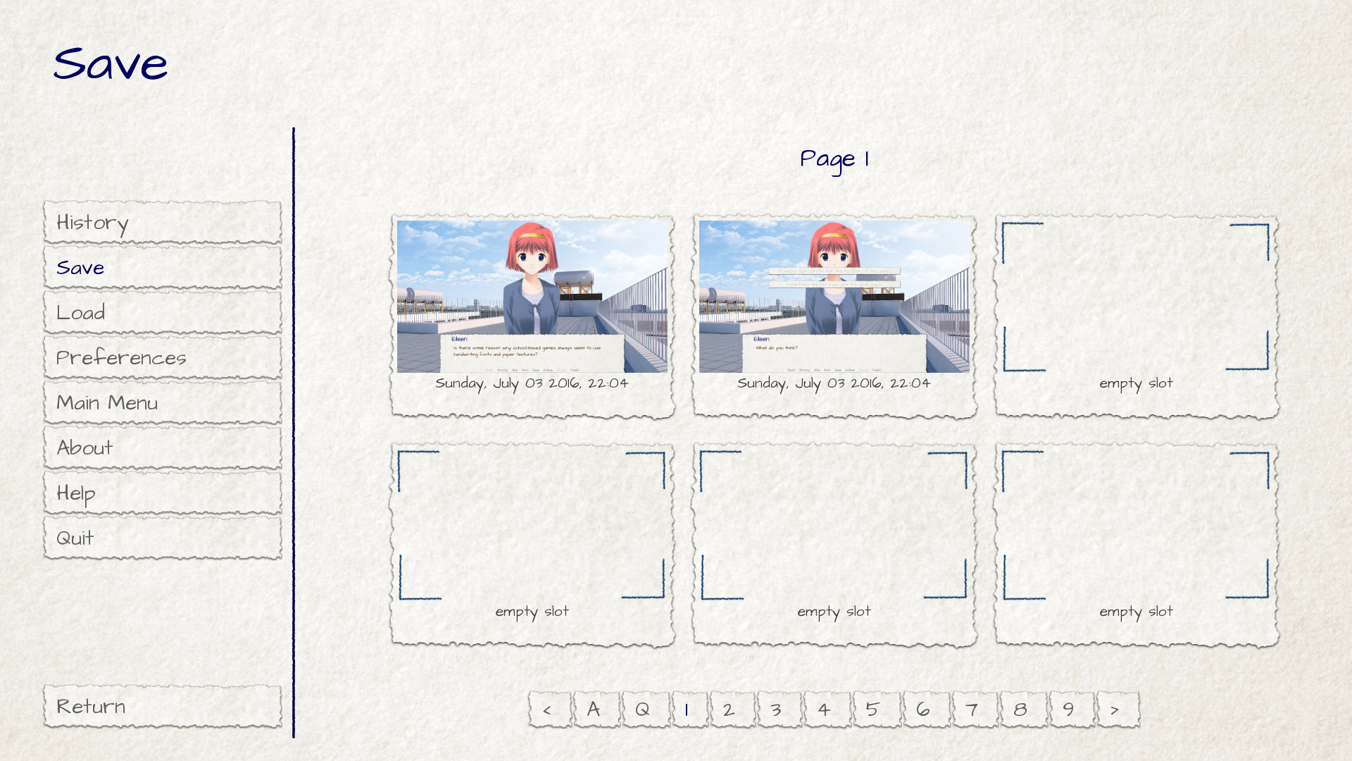
The save screen after applying the customizations given in this section.
Sliders
Sliders are a type of bar that is used in the preferences screen to allow the player to adjust preference with a large number of values. By default, the GUI only uses horizontal sliders, but a game may also use vertical sliders.
Sliders are customized with the following images:
- gui/slider/horizontal_idle_bar.png, gui/slider/horizontal_hover_bar.png, gui/slider/vertical_idle_bar.png, gui/slider/vertical_hover_bar.png
Images used for vertical and idle bar backgrounds in idle and hover states.
- gui/slider/horizontal_idle_thumb.png, gui/slider/horizontal_hover_thumb.png, gui/slider/vertical_idle_thumb.png, gui/slider/vertical_hover_thumb.png
Images used for the thumb – the movable part of the bar.
The following variables are also used:
- define gui.slider_size = 64
The height of horizontal sliders, and width of vertical sliders.
- define gui.slider_tile = True
If true, the frame containing the bar of a slider is tiled. If False, if it scaled.
- define gui.slider_borders = Borders(6, 6, 6, 6)
- define gui.vslider_borders = Borders(6, 6, 6, 6)
The borders that are used with the Frame containing the bar image.
Here's an example of how we customize the horizontal slider.

An example gui/slider/horizontal_idle_bar.png image.

An example gui/slider/horizontal_hover_bar.png image.

An example gui/slider/horizontal_idle_thumb.png image.

An example gui/slider/horizontal_hover_thumb.png image.
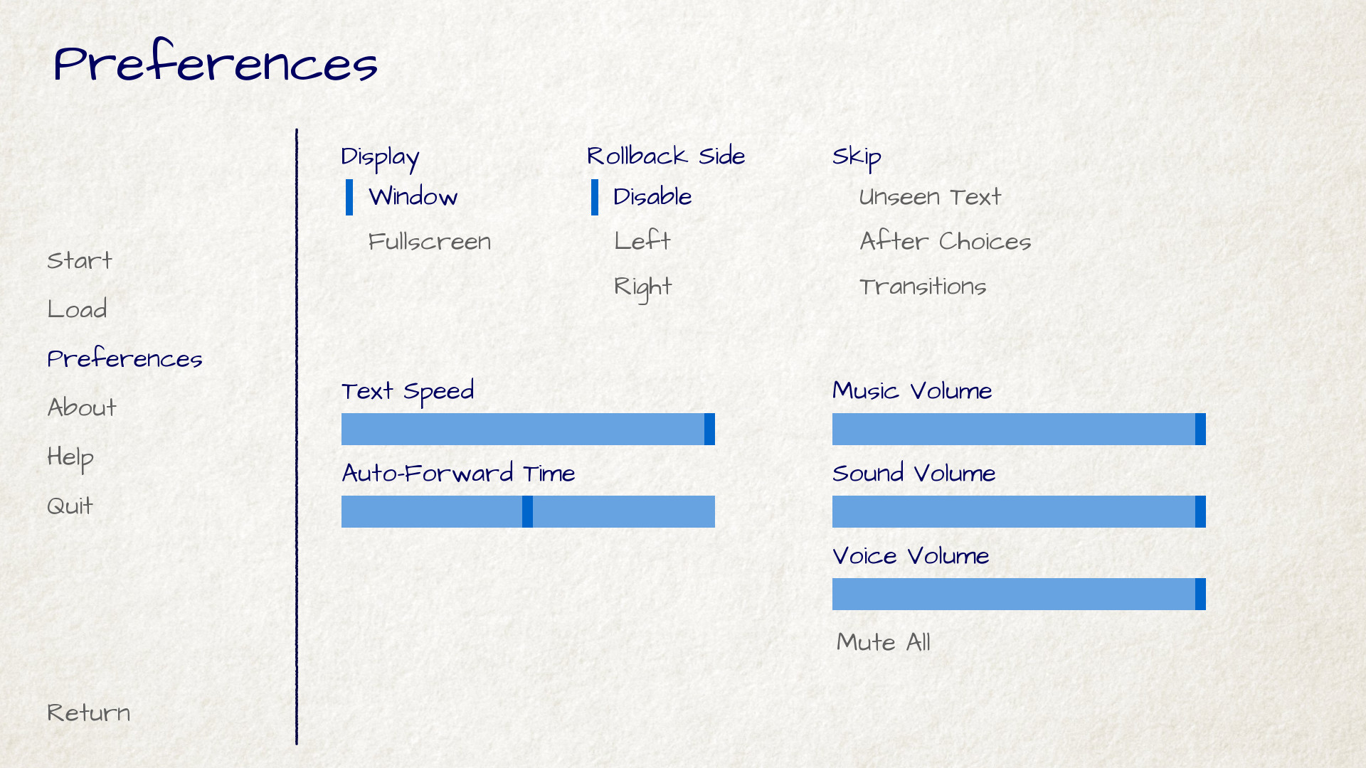
The preferences screen after applying the customizations given in this section.
Scrollbars
Scrollbars are bars that are used to scroll viewports. In the GUI, the most obvious place a scrollbar is used is the history screen, but vertical scrollbars can be used on other screens as well.
Scrollbars are customized with the following images:
- gui/scrollbar/horizontal_idle_bar.png, gui/scrollbar/horizontal_hover_bar.png, gui/scrollbar/vertical_idle_bar.png, gui/scrollbar/vertical_hover_bar.png
Images used for vertical and idle bar backgrounds in idle and hover states.
- gui/scrollbar/horizontal_idle_thumb.png, gui/scrollbar/horizontal_hover_thumb.png, gui/scrollbar/vertical_idle_thumb.png, gui/scrollbar/vertical_hover_thumb.png
Images used for the thumb – the movable part of the bar.
The following variables are also used:
- define gui.scrollbar_size = 24
The height of horizontal scrollbars, and width of vertical scrollbars.
- define gui.scrollbar_tile = True
If true, the frame containing the bar of a scrollbar is tiled. If False, if it scaled.
- define gui.scrollbar_borders = Borders(10, 6, 10, 6)
- define gui.vscrollbar_borders = Borders(6, 10, 6, 10)
The borders that are used with the Frame containing the bar image.
- define gui.unscrollable = "hide"
This controls what to do if the bar is unscrollable. "hide" hides the bar, while None keeps it shown.
Here's an example of how we customize the vertical scrollbar.

An example gui/scrollbar/vertical_idle_bar.png image.

An example gui/scrollbar/vertical_hover_bar.png image.

An example gui/scrollbar/vertical_idle_thumb.png image.

An example gui/scrollbar/vertical_hover_thumb.png image.
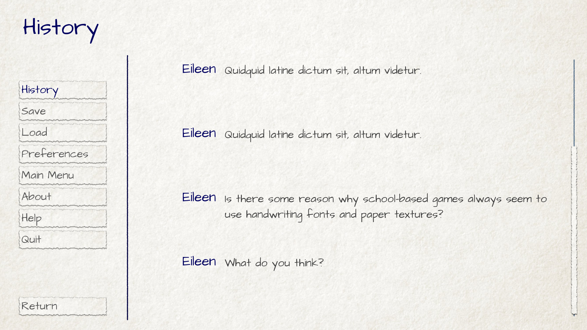
The history screen after applying the customizations given in this section.
Bars
Plain old bars are used to display a number to the player. They're not used in the GUI, but can be used in creator-defined screens.
A bar can customized by editing the following images:
- gui/bar/left.png, gui/bar/bottom.png
Images that are used for the filled section of horizontal and vertical bars.
- gui/bar/right.png, gui/bar/top.png
Images that are used for the filled section of horizontal and vertical bars.
There are also the usual variables that control bars:
- define gui.bar_size = 64
The height of horizontal bars, and width of vertical bars.
- define gui.bar_tile = False
If true, the bar images are tiled. If false, the images are linearly scaled.
- define gui.bar_borders = Borders(10, 10, 10, 10)
- define gui.vbar_borders = Borders(10, 10, 10, 10)
The borders that are used with the Frames containing the bar images.
Here's an example of how we customize horizontal bars.

An example gui/bar/left.png image.

An example gui/bar/right.png image.
A screen we defined to give an example of a bar.
Skip and Notify
The skip and notify screens both display frames with messages in them. Both use custom frame background images:
- gui/skip.png
The background of the skip indicator.
- gui/notify.png
The background of the notify screen.
The variables that control these are:
- define gui.skip_frame_borders = Borders(24, 8, 75, 8)
The borders of the frame that is used by the skip screen.
- define gui.notify_frame_borders = Borders(24, 8, 60, 8)
The borders of the frame that is used by the notify screen.
- define gui.skip_ypos = 15
The vertical position of the skip indicator, in pixels from the top of the window.
- define gui.notify_ypos = 68
The vertical position of the notify message, in pixels from the top of the window.
Here is an example of customizing the skip and notify screens.

An example gui/skip.png image.

An example gui/notify.png image.
These skip and notify screens in action.
Dialogue, Continued
In addition to the simple customizations given above, there are a number of ways to control how dialogue is presented to the player.
Textbox
The textbox (or window) is the window the dialogue is displayed in. In addition to changing gui/textbox.png, the following variables control how the textbox is displayed.
- define gui.textbox_height = 278
The height of the textbox window, which should also be the height of gui/ textbox.png.
- define gui.textbox_yalign = 1.0
The placement of the textbox vertically on the screen. 0.0 is the top, 0.5 is center, and 1.0 is the bottom.
Name and Namebox
The character's name is placed inside a frame that uses gui/namebox.png as its background. In addition, there are a number of variables that control the presentation of the name. The namebox is only show if the speaking character has a name (an empty name, like " ", counts).
- define gui.name_xpos = 360
- define gui.name_ypos = 0
The horizontal and vertical positions of the name and namebox. These are usually a number of pixels from the left or top side of the textbox. Setting a variable to 0.5 centers the name in the textbox (see below). These numbers can also be negative – for example, setting gui.name_ypos to -22 causes it to be places 22 pixels above the top of the textbox.
- define gui.name_xalign = 0.0
The horizontal alignment of the character's name. This can be 0.0 for left- aligned, 0.5 for centered, and 1.0 for right-aligned. (It's almost always 0.0 or 0.5.) This is used for both the position of the namebox relative to gui.name_xpos, and to select the side of of the namebox that is aligned with xpos.
- define gui.namebox_width = None
- define gui.namebox_height = None
- define gui.namebox_borders = Borders(5, 5, 5, 5)
- define gui.namebox_tile = False
These variables control the display of the frame containing the namebox.
Dialogue
- define gui.dialogue_xpos = 402
- define gui.dialogue_ypos = 75
The horizontal and vertical positions of the actual dialogue. These are usually a number of pixels from the left or top side of the textbox. Setting a variable to 0.5 centers the dialogue in the textbox (see below).
- define gui.dialogue_width = 1116
This variable gives the maximum width of a line of dialogue, in pixels. When dialogue reaches this width, it will be wrapped by Ren'Py.
- define gui.dialogue_text_xalign = 0.0
The horizontal alignment of dialogue text. 0.0 is left aligned, 0.5 is centered, and 1.0 is right-aligned.
Examples
To center the character's name, use:
define gui.name_xpos = 0.5
define gui.name_xalign = 0.5
To center dialogue text, use:
define gui.dialogue_xpos = 0.5
define gui.dialogue_text_xalign = 0.5
Our example game uses these statements to customize the centered namebox:
define gui.namebox_width = 300
define gui.name_ypos = -22
define gui.namebox_borders = Borders(15, 7, 15, 7)
define gui.namebox_tile = True
An example gui/namebox.png image.
The example game, customized with the settings above.
History
There are a few variables that control the way the history screen is displayed.
The config.history_length variable, which defaults to 250,
sets the number of blocks of dialogue Ren'Py will keep at history.
- define gui.history_height = 210
The height of a history entry, in pixels. This can be None to allow the height of a history entry to vary at the cost of performance – config.history_length may need to be lowered significantly when this is None.
- define gui.history_spacing = 0
The amount of space to leave between history entries, in pixels.
- define gui.history_name_xpos = 0.5
- define gui.history_text_xpos = 0.5
The horizontal positions of the name label and dialogue text. These can be a number of pixels from the left side of the history entry, or 0.5 to center.
- define gui.history_name_ypos = 0
- define gui.history_text_ypos = 60
The vertical positions of the name label and dialogue text, relative to the top of a history entry, in pixels.
- define gui.history_name_width = 225
- define gui.history_text_width = 1110
The width of the name label and dialogue text, in pixels.
- define gui.history_name_xalign = 0.5
- define gui.history_text_xalign = 0.5
This controls the alignment of text and the side of the text that is aligned with xpos. 0.0 is left-aligned, 0.5 is center-aligned, 1.0 is right-aligned.
The history screen customized with the settings given above.
NVL
The nvl screen displays NVL-mode dialogue. There are a number of ways it can be customized. The first is to customize the NVL-mode background image:
- gui/nvl.png
The background image used in NVL-mode. This should be the same size as the game window.
There are also a number of variables that are used to customize the way NVL-mode text is displayed.
- define gui.nvl_borders = Borders(0, 15, 0, 30)
The borders around the background of the NVL-mode. Since the background is not a frame, this is only used to pad out the NVL-mode to prevent it from pressing up against the sides of the screen.
- define gui.nvl_height = 173
The height of a single NVL-mode entry. Setting this to a fixed height makes it possible to have NVL-mode without paging, showing a fixed number of entries at once. Setting this to None allows entries to be of a variable size.
- define gui.nvl_spacing = 15
The spacing between entries when gui.nvl_height is None, and the spacing between NVL-mode menu buttons.
- define gui.nvl_name_xpos = 0.5
- define gui.nvl_text_xpos = 0.5
- define gui.nvl_thought_xpos = 0.5
The positioning of character names, dialogue text, and thought/narration text, relative to the left side of the entry. This can be a number of pixels, or 0.5 to represent the center of the entry.
- define gui.nvl_name_xalign = 0.5
- define gui.nvl_text_xalign = 0.5
- define gui.nvl_thought_xalign = 0.5
The alignment of the text. This controls both the alignment of the text, and the side of the text that is placed at xpos. This can be 0.0 for left, 0.5 for center, and 1.0 for right.
- define gui.nvl_name_ypos = 0
- define gui.nvl_text_ypos = 60
- define gui.nvl_thought_ypos = 0
The position of character names, dialogue text, and thought/narration text, relative to the top of the entry. This should be a number of pixels from the top.
- define gui.nvl_name_width = 740
- define gui.nvl_text_width = 740
- define gui.nvl_thought_width = 740
The width of each kind of text, in pixels.
- define gui.nvl_button_xpos = 0.5
- define gui.nvl_button_xalign = 0.5
The position and alignment of NVL-mode menu buttons.
Ren'Py does not use NVL-mode by default. It must be invoked using NVL-mode
characters, and by defining a few variables in script.rpy.
define e = Character("Eileen", kind=nvl)
define narrator = nvl_narrator
define menu = nvl_menu
Here's an example of the NVL screen as customized with the settings above.
An example gui/nvl.png image.
The example game, customized with the settings above.
Text
Most text can be customized using GUI variables. The variables used are of the form:
- define gui.kind_text_font
If present, the font used for the text.
- define gui.kind_text_size
If present, the size of the text.
- define gui.kind_text_color
If present, the color of the text.
Other text style properties cam also be
set in the same way. For example, gui.kind_text_outlines sets the
outlines property.
The kind prefix can be omitted, in which case it customizes the default look of text. Otherwise, it may be one of the button kinds above, or one of:
- interface
For default text in the out-of-game interface.
- input
For text in a text input widget.
- input_prompt
For the prompt portion of a text input.
- label
For decorative labels.
- prompt
For confirmation prompts asking the player a question.
- name
For character names.
- dialogue
For dialogue.
- notify
For notification text.
For example:
define gui.dialogue_text_outlines = [ (0, "#00000080", 2, 2) ]
puts a drop shadow to the right of and below dialogue text.
Translation and GUI Variables
The gui namespace is special, in that it is saved after the init phase,
but before any translate python blocks are run. This makes it possible to
change any GUI variable in a translate python block to accommodate a second
language. For example, the following code changes the default text font
and size.
translate japanese python:
    gui.text_font = "MTLc3m.ttf"
    gui.text_size = 24
There is one issue that translators need to be aware of, and that is that
in some places in gui.rpy, one variable is assigned the value of another.
For example, the default gui.rpy has:
define gui.interface_text_font = "DejaVuSans.ttf"
and later on:
define gui.button_text_font = gui.interface_text_font
Since both of these statements run before any translate block runs, both
variables need to be changed.
translate japanese python::

    define gui.interface_text_font = "MTLc3m.ttf"
    define gui.button_text_font = "MTLc3m.ttf"
If the second statement was missing, DejaVuSans would still be used.
Advanced Customization
More advanced customization is possible by customizing screens.rpy,
up to and including deleting the entire contents of the file and replacing
it with something of your own. Here are a few places to get started.
Styles
Styles and style properties control how displayables are displayed. To find out what style a displayable is using, put the mouse over it and type Shift+I. This invokes the style inspector, which shows style names. Once the style name is known, a style statement can be used to customize it.
For example, say we've lost our minds writing GUI documentation, and want to
add a bright red outline to the dialogue text. We can hover the text and press
Shift+I to find out the style used is named say_dialogue. We can then
add (to the end of screens.rpy, or somewhere in options.rpy) the style statement:
style say_dialogue:
    outlines [ (1, "#f00", 0, 0 ) ]
A huge number of customizations are possible using style statements.
Screens - Click to Continue
A screen we expect to be commonly added is the click to continue screen. This is a screen that is shown when text finishes displaying. Here's a simple example:
screen ctc(arg=None):

    frame:
        at ctc_appear
        xalign .99
        yalign .99

        text _("(click to continue)"):
            size 18

transform ctc_appear:
    alpha 0.0
    pause 5.0
    linear 0.5 alpha 1.0
This particular ctc screen uses a transform to show the frame after 5 seconds. It's a good idea to delay CTC animations for several seconds, to give Ren'Py time to predict and load images.
Total GUI Replacement
Advanced creators can replace some or all of screens.rpy in its entirely.
When doing so, some or all of the contents of gui.rpy may become redundant.
It's probably a good idea to call gui.init() to reset styles – but after
that, a creator can do whatever they want. It usually makes sense to include
some or all of the special screens, to make sure
players can have access to all the functionality Ren'Py provides.
See Also
For more information about the GUI, see the Advanced GUI section.
Incompatible GUI Changes
As the GUI is changed, occasionally some of the variables change name. These changes only take effect when the GUI is regenerated – until then, the game will continue to use the old variable names in the new Ren'Py.
6.99.12.3
gui.default_font -> gui.text_font
gui.name_font -> gui.name_text_font
gui.interface_font -> gui.interface_text_font
gui.text_xpos -> gui.dialogue_xpos
gui.text_ypos -> gui.dialogue_ypos
gui.text_width -> gui.dialogue_width
gui.text_xalign -> gui.dialogue_text_xalign